TOP

SyZyGy

Tools
_

Adobe Photoshop, Illustrator

Role
_

Brand Designer

Description
_

VI Design for a Japanese tea & braised food bar in Taipei, Taiwan.

Brand Concept
It came to Paul in a Japanese style tea bar one night, when he was sitting alone deep in thought. The complementary taste of braised food with Japanese tea wine seemed to invoke a long-lost ritual. Paul was deeply moved by such an atmosphere of tranquility and refuge for the soul, immersed in a momentary calming and healing experience of being an island unto himself. He decided on the spot that it was to be his brand concept: creating a space that offers such a sensation and his well-known braised food dishes.
Brand Name Design
The bar is named SyZyGy in English, which is a term in astronomy meaning, “a roughly straight-line configuration connecting several of the nine planets.” It is also used to refer to a rare and beautiful surprise. The full name of the bar is 孤獨 (Solitary) SyZyGy, representing a solitary existence as rare and precious as a syzygy. By visiting the bar, every individual transfers their solitude into an exquisite and once in a lifetime experience.
Visual Planning
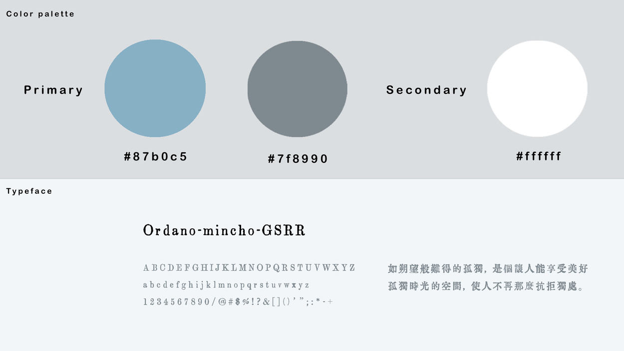
Standardizing Brand Colors
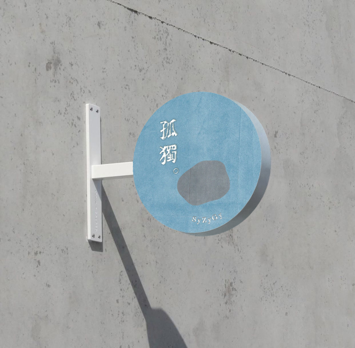
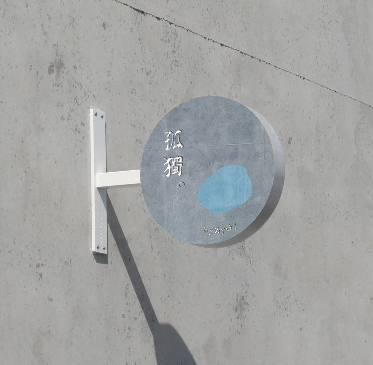
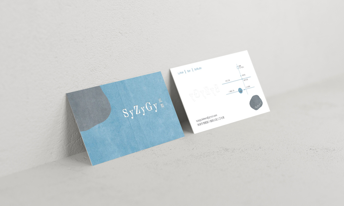
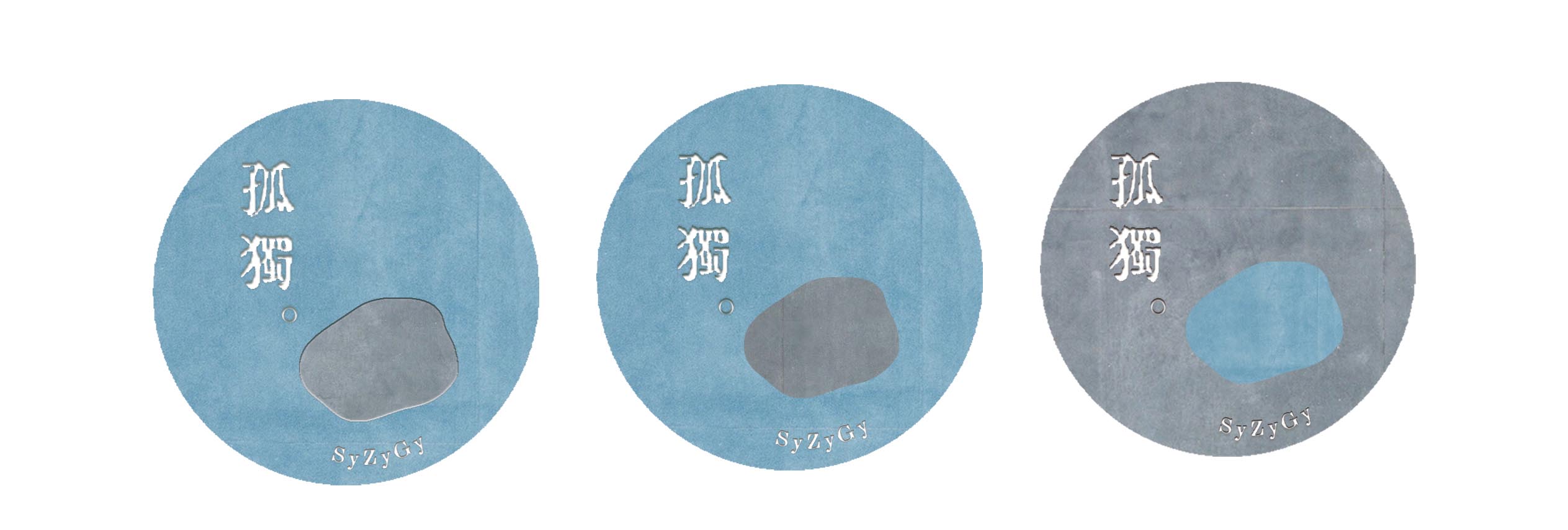
SyZyGy wants to present an ambience of tranquility and peace. Blue is imbued with religious and spiritual connotations, implying a sense of serenity and harmony. It is also the color of water, giving the viewers a sense of soothing and comfort. Thus a warm grayish blue has been chosen as the main color in the color scheme to evoke the inner peacefulness of the visitors. Furthermore, the varying shades of complementary gray colors convey the calming presence of philosophers, which also signifies an intention to locate an inner balance. The words on the signage were painted milky white to symbolize piety and purity, but standing alone on the plaque, the words also seem to tell a story of a lonesome existence.