CoursePerfect
- UX Design App -
Brief
Role: UX Researcher & Designer
Date: Dec 2019
Tools: Balsamiq, MarvelApp, Pen and paper
Background
The project was completed in the course “Design in the Digital World” under the instruction of Dr. Kate Devlin and Dr. Elisa Oreglia at King’s College London (KCL). The aim of this project is to learn the UX research and design process.
The goal of this module ratings app is to develop an app specifically for KCL students, allowing them to easily determine the relevance id available modules to their paths of study.
Problems
According to observations made in natural settings, many King’s students select their preferred modules based on module descriptions, by direct contact with convenors, by asking prior module attendees (many are considered hard to reach), or by searching online for details. However, particulars about modules are widely dispersed and difficult for students to integrate. Additionally, end of term module evaluation report forms are mainly provided to professors; and students may not even be aware of the results feedback.
Research
I did literature reviews and analyzed existing apps and websites related to education evaluation, including ‘rate my professor’, ‘rate my teacher’, ‘ClassRate’, ‘NTU Course’, ‘KCL end-of-term Online Evaluation Form’, and some alumni apps.
Interview and Observation
I adopted semi-structured interviews to understand the challenges students had and their use of existing related products, and observed their behavior in real context.
My interviewees included current KCL students facing difficulties in making their module selections, and previous alumni willing to share their experiences and connect with students. To ensure a broader accessibility range, I involved both local and international students, under different conditions and course types.
Persona
Based on insights I obtained from interviews, I built two personas representing two types of users this app targeted – Novice students and Former Students.
User Flow
Before producing user flow, I created scenarios to reflect the motivations of personas and address possible solutions to their problems, which provided me a clear idea of the requirements and helped me to produce user flow and interfaces.
Sketch
Detailed Design
After sketching my designs with different options, I developed them into Lo-fi prototypes using Balsamiq and Marvel to focus on verifying and testing functionality with targeted users without concern for visual details. This provides the fastest-possible way to iterate my design ideas combining users’ feedback.
My Profile & Identity Selection
After logging in, students need to create their profile including their major, interests, and optional contact details to allow others connect with them, which enhances networking between alumni. When rating modules, users can choose to show their identity, just show their major, or be completely anonymous.
Module listing page
In line with user requirements, all module types (compulsory / optional / additional) are displayed on the same scrolling page, with the most highly-rated module at the top, and only include only the most important information.
From the interviews, I found that the main user expectation at this stage is to search for the most popular modules when deciding their selection.
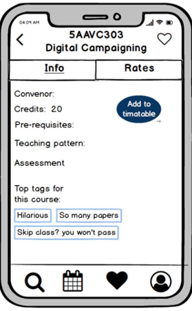
Specific Module Page: Info
After a module is clicked, users can see more detailed module information in the ‘info’ section, and switch pages at any time to view the evaluation of the module in the ‘rates’ section. In the top right corner, users can directly save, rate, or add the module to their timetable.
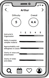
Specific Module Page: Ratings
The color palette from dark (heavy) to light (easy) green show the module’s difficulty level. I designed a multi-criteria module evaluation feature to be more comprehensive and measurable, allowing users to consider the items they are most concerned about.
On the second page, I decided on five criteria based on analysis of King’s evaluation form and existing apps, letting users easily evaluate the module with indicators. The overall score at the top will change according to different values selected.
The last page suggests preparation time per week with the results to help schedule and workload planning, with 3 tags describing this module by commenters. A feedback system is provided at the end to assist in future improvements and development of this app.
My Timetable
The timetable provides necessary information to help users intuitively gauge time and distance between preferred modules, and allow them to easily edit, add and remove modules. Users can go directly back to view the details and ratings of specific module by clicking on that module’s strip.
Usability Testing
Using Lo-fi prototypes, I tested different alternatives with my targeted users and had interviews afterwards to understand their satisfaction level and additional feedback. This allows me to choose the most relevant and usable designs that would provide better user experience.
Discarded Alternatives – Rate Button
According to the usability tests and satisfaction interviews, users feel more comfortable to easily change between two sections. I then changed the design to avoid unnecessary complexity finding the button.
Discarded Alternatives – Star Ratings
As this app includes multiple evaluation criteria, most of my selected users think that the star rating system like the one that thestudentroom.co.uk provides is annoying and distracting when all shown on the same pages.
Discarded Alternatives – Difficulty Score
I observed that some users feel confused when filling in difficulty score, putting two scores (difficulty and overall) together leads to confusion and thus taking more time.
Summary
This is my very first UX project, I learned so much about the UX process and how to design and collaborate.
I made some mistakes and was able to turn them mistakes into lessons learned. If I have the chance to redo the project, I will consider:
- Users can share their favorite modules list with friends
- Statistics
- Combine social media functions: create a section on the profile page where users can post contents of their experience/life
- Consider notifications