SyZyGy
Tools
_
_
Adobe Photoshop, Illustrator
Role
_
_
Brand Designer
Description
_
_
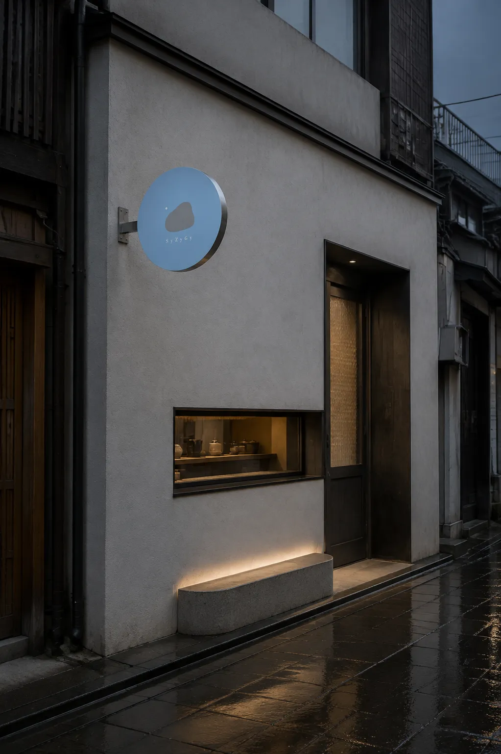
VI Design for a Japanese tea & braised food bar in Taipei, Taiwan.
Brand Concept
SyZyGy began with a quiet moment experienced by its founder and owner, Paul, in a Japanese-style tea bar. The pairing of braised dishes and tea-infused spirits felt almost ritualistic, transforming solitude into a sense of refuge. Inspired by this experience, Paul created a place where guests could step away from everyday noise and find comfort in their own company.
Naming
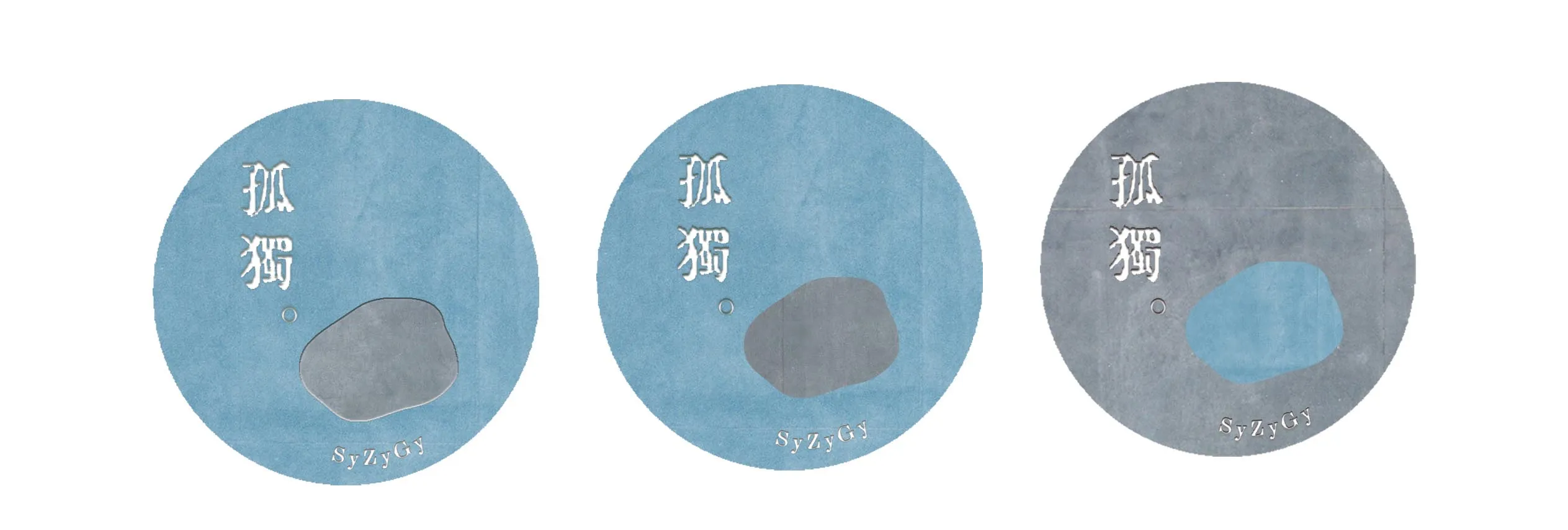
In astronomy, syzygy describes a rare alignment of celestial bodies. Paired with 孤獨, meaning “solitude,” the name reframes being alone as a valuable moment of balance and connection with oneself.
Visual Identity
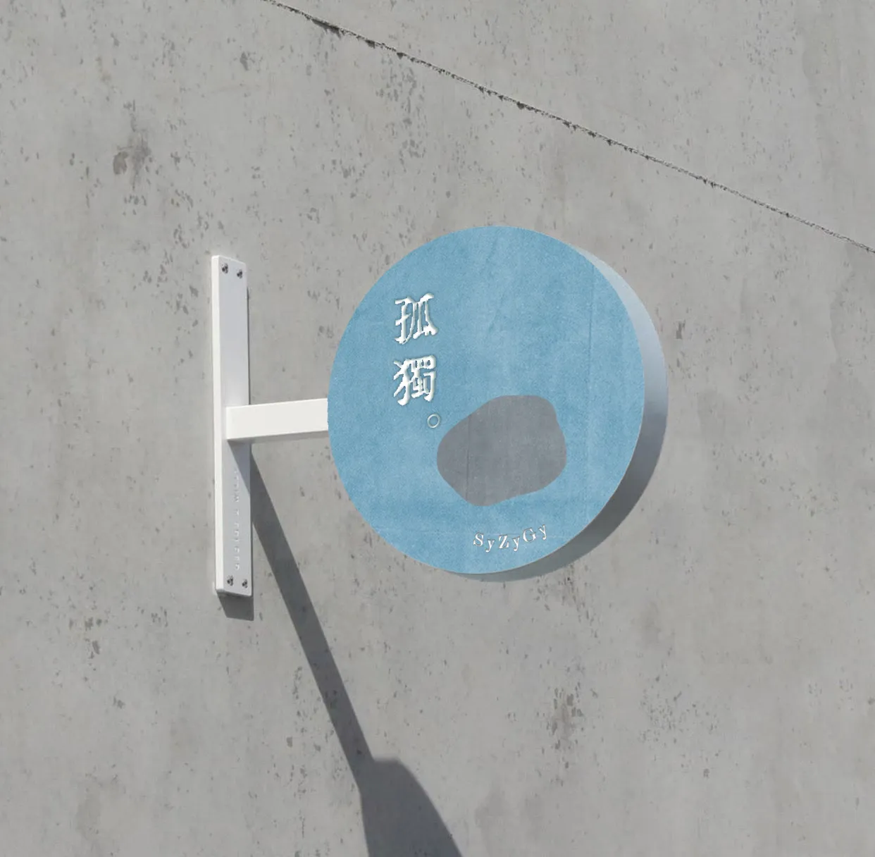
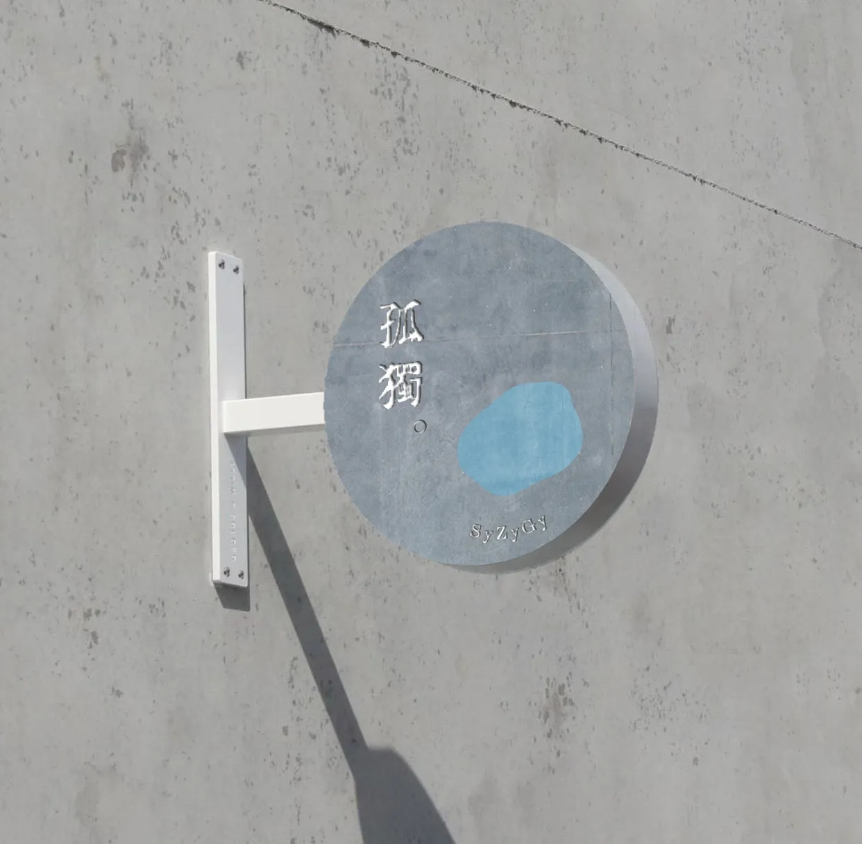
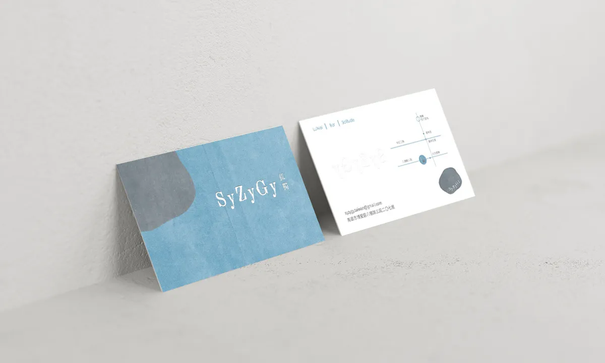
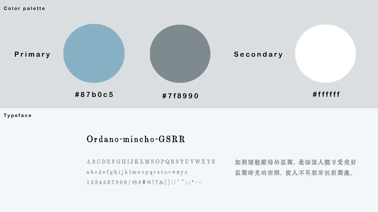
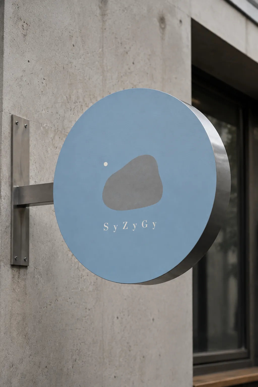
The logo reduces this idea to an irregular stone and a single floating dot. The stone represents both an island and the individual self, while the dot suggests a distant celestial body and a quiet full stop. Warm gray-blue evokes water and stillness, complemented by grounded stone gray and milky white. Generous negative space gives the identity its calm, contemplative character.